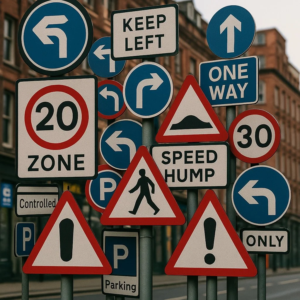
Too Many Signs, Not Enough Sense: The Visual Noise of Modern Cities
We’ve talked about the soundscape of our cities — the constant hum, the drone, the sirens that never quite stop. But there’s another kind of noise we rarely acknowledge: visual noise. The chaos of signage, flashing lights, painted warnings, and glowing billboards cluttering every urban corner. All telling us what to do, where to go, how fast to travel — until we stop noticing any of it at all.
This isn’t just about aesthetics. It’s about how we experience the world. How we feel in a place. Visual noise is real, and it has a cost.
The Sign Saturation Problem
Stand on almost any corner in a city like Auckland and look around. Within 100 metres you might find a 30km/h speed limit sign, a speed bump warning, pedestrian crossing sign, a no parking sign, a bus lane sign, a loading zone, a sandwich board on the footpath, a blinking pedestrian crossing light, an advertising poster, and a digital billboard cycling through ten ads at blinding brightness. Each one vying for a split second of your attention. Each one assuming you aren’t already overwhelmed.
It’s not just the sheer number of signs — it’s their relentlessness. We are assaulted by instruction. We are told how to move, how fast to go, when to cross, where to park, how to behave. Our urban spaces have become like an overbearing teacher, micromanaging every moment.
And just like in the classroom, we start tuning out.
When Everything Shouts, No One Listens
The irony is, the more signage you add, the less effective it becomes. Urban planners seem to know this, and yet the response is almost always the same: more signs. A bigger one. A brighter one. A flashing one.
It’s a cycle of diminishing returns. We ignore the signs, so we get more of them. But at some point, the clutter itself becomes dangerous. Important messages are drowned out in a sea of less relevant ones. And all the while, our senses are working overtime just to process what to filter out.
Then there are the billboards. Once passive images, now animated digital displays. These are not designed to inform — they are designed to hijack attention. I can see one from where I live, a good 20 to 30-minute walk from the city centre. Its glow spills out over rooftops and treetops, an artificial sun cycling through product ads. What does it mean for the people who live across the street? Or children trying to focus in a classroom opposite? This isn’t just clutter — it’s intrusion.
Designing for Intuition, Not Instruction
So what’s the alternative?
One of the most fascinating experiments in recent urban design comes from Drachten, a town in the Netherlands that famously removed nearly all road signs, traffic lights, and painted lines in its town centre. The result? Traffic slowed. Eye contact increased. Pedestrians and drivers became more aware of one another. Accidents dropped.
By removing instruction, the town made space for intuition.
This is a principle worth exploring. Instead of assuming people need to be told what to do at every step, what if we designed spaces that simply make sense? That signal intent through form, material, rhythm, planting, and texture rather than plastic signs?
Think of how a narrowing road encourages us to slow down. Or how the texture of paving changes to cue pedestrians to pause. These are soft cues. They respect our intelligence. They speak to us at a sensory level, not an authoritarian one.
"Dress Appropriately": Trust and Common Sense
There’s a well-known story from General Motors. When Mary Barra became CEO, she reviewed the company’s 10-page dress code policy and replaced it with just two words: “Dress appropriately.”
That same principle could apply to signage. What if instead of shouting at people to obey a barrage of micro-rules, we cultivated environments that encouraged people to walk appropriately, drive appropriately, behave appropriately?
Urban design should model trust. The best public spaces invite responsibility. They work not because they over-police but because they feel good to be in. They offer clarity, not control.
Soulful Cities Need Visual Silence
Soulful architecture — the kind we advocate for at Daedal — is not just about buildings. It’s about the spaces between them. It’s about what the city feels like at street level. A soulful city allows for pause. It allows us to see the sky, notice the seasons, hear the wind move through the trees. That’s impossible when your visual field is jammed with instructions and interruptions.
Visual noise deadens a city. It makes us tired without knowing why. It strips away the possibility for wonder and subtlety. Just like acoustic noise can fray nerves, visual noise dulls our perception.
In contrast, cities that trust their people, cities that communicate softly, give us room to breathe. Room to think. Room to feel something more than obligation.
A Call to Design Less
We don’t need more signs. We need more sense.
We need design that speaks without shouting. Cities that guide rather than dictate. Environments that communicate through their character, their scale, their rhythms, and their respect for the human scale.
Let’s start with this question: what would it look like to take down half the signs in your neighbourhood? What might happen if we trusted people to feel their way through a space? What could we design instead of the next billboard?
Cities are not machines. They are ecosystems. And the more they behave like ecosystems, the more intuitive, beautiful, and human they become.
Let’s design cities that speak less… and say more.
